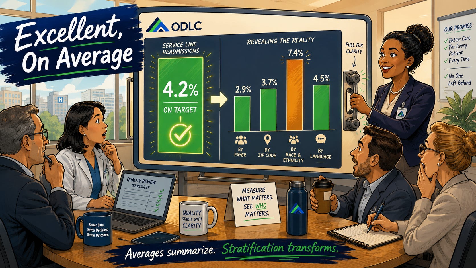
Picture it: the quarterly quality review for a joint replacement service line.
Ninety-day readmissions are at 4.2%, ahead of the benchmark. Patient-reported outcome collection is above target. Length of stay is at the goal. The slides are “green” from edge to edge, and the meeting ends four minutes early, which in health system time is a standing ovation.
Two weeks later, an analyst preparing for a payer negotiation runs the same readmission number, this time split by payer and home zip code.
The average was 4.2%. Underneath it: 2.9% for one population and 7.4% for another.
Same surgeons. Same perioperative pathways. Same building.
The service line had one readmission rate on its dashboard and at least two in real life.
Does this sound familiar to you? Let’s dive deeper.
The dashboard was built to answer the question, “How are we doing against the benchmark?” And it answers that question honestly.
Aggregate metrics were designed for external comparison, and they are good at it. What they were never designed to do is tell you who is included in your performance.
An average is a summary, and every summary makes a decision about what to leave out.
The evidence for what gets left out keeps arriving.
- A Johns Hopkins study published this year found that Black Medicare patients are disproportionately admitted to lower-quality hospitals even when a highly rated hospital is nearby. Those admission patterns carry higher risks of death, complications, and readmission that no single facility average would ever surface.
- The Commonwealth Fund’s 2026 State Health Disparities Report stratified 24 performance indicators by race and ethnicity and found the same story at the population level: aggregate performance and lived performance routinely diverge, sometimes dramatically, within the same state and the same delivery system.
And here is the 2026 context our network needs to hold clearly:
The federal reporting infrastructure that recently pushed organizations to look underneath the average has been significantly narrowed.
CMS has removed several health equity and social determinants of health measures from major hospital quality-reporting programs, and the ACO equity adjustment has also been discontinued. A few states, including California, continue to require stratified reporting through their Hospital Equity Measures Reporting Programs.
Many do not.
For many organizations, whether outcomes are routinely stratified can no longer be treated primarily as a federal compliance question. It is a leadership decision, made one dashboard at a time.
Change the Frame
When the numbers are green, most leadership rooms ask one question:
Are we performing?
The more useful question is the one the analyst answered almost by accident:
Who is included in our performance?
An unstratified metric is a decision about what the organization is willing to know.
It does not feel like a decision because it arrives as a default. The report was simply built that way years ago by someone optimizing for a benchmark submission.
But defaults are choices with better alibis.
A system that reviews only averages has, structurally, chosen to learn about its disparities from a payer, a journalist, a regulatory inquiry, or a lawsuit rather than from its own quality committee.
There is also a quality argument here, independent of any equity framing, and I have watched it persuade skeptical financial leaders:
A 7.4% readmission rate inside your 4.2% average is unmanaged clinical variation.
Rework, penalty exposure, avoidable costs, and preventable patient harm are currently invisible to the people funded to reduce them.
Finding the split is simply a better operational move.
Translation to Practice
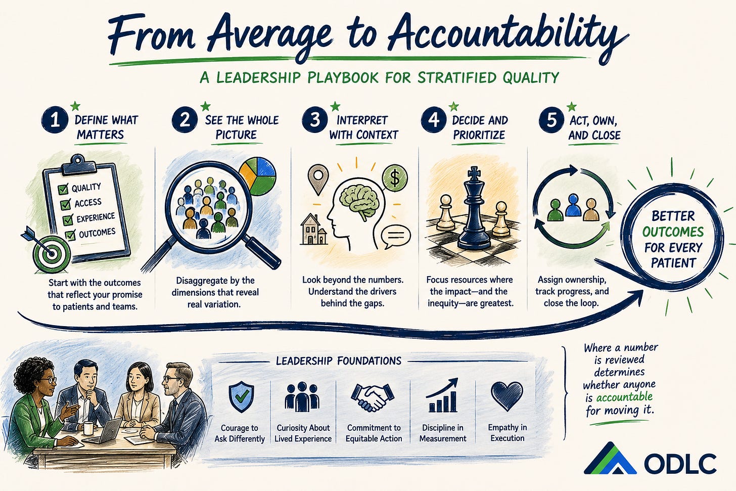
Here are five leadership moves to begin on Monday morning.
1. Define what matters
Start with the outcomes that represent your organization’s promise to patients and teams.
Choose the three measures your service line already reviews every quarter. They might include readmissions, complications, patient-reported outcomes, time to surgery, access intervals, length of stay, or care-plan completion.
The goal is not to create a separate measurement universe; instead, we should better understand the performance measures that already govern your world.
2. See the whole picture
Ask your analytics team to stratify those measures by payer, race and ethnicity, preferred language, geography, and other dimensions that may reveal meaningful variation.
This is often less of a technical lift than leaders assume. Many analytics teams can produce an initial view within weeks.
The greater challenge is often that no one has made the request.
If the analysis has never been run, that fact is itself a finding.
3. Interpret the findings with context
A difference in outcomes is a signal, not yet an explanation.
Look beyond the number.
Examine care pathways, referral patterns, appointment availability, transportation barriers, language access, post-acute support, benefit design, clinical decision-making, and differences in where patients enter or exit the system.
Stratification tells you where to look.
Leadership determines whether the organization looks deeply enough to understand what it finds.
4. Decide and prioritize
Set the action threshold before you see the data.
Decide in advance what size of difference triggers a formal review, additional analysis, or intervention.
Stratified findings frequently die in interpretation debates:
Is the gap large enough?
Is the denominator too small?
Is this the correct comparison?
Do we need another quarter of data?
Those may be legitimate questions, but without a pre-committed threshold, they can also become mechanisms for delay.
A defined threshold converts the conversation from interpretation into protocol.
It also helps leaders direct resources toward the gaps with the greatest clinical, operational, and financial consequences.
5. Act, own, and close
Review the stratified findings alongside the aggregate metric.
A stratified report that lives in a separate equity committee is a report competing for attention; it is unlikely to win.
Put the split on the same slide, in the same quarterly meeting, in front of the same clinical and operational owners.
Assign responsibility. Establish the intervention. Track progress. Return to the measure.
Where a number is reviewed determines whether anyone is accountable for moving it.
Finally, protect the data fields themselves.
With several federal measures retired, the collection infrastructure behind race, ethnicity, language, and social-needs data no longer has the same external guardian.
Those fields can decay quietly unless someone inside the organization owns their accuracy, completeness, and continued use.
Name that owner now, while the data is still usable.
Building the Leadership Capability
Connecting measurement, interpretation, and governance requires more than technical fluency.
Leaders must know how to recognize variation, ask better questions, engage the right operational owners, allocate resources, and maintain accountability when no external mandate is forcing the issue.
That is precisely why we developed the Dynamize Health Certificate Program in Transformative Value-Driven Care.
It is designed for leaders who need evidence, operational fluency, and strategic conviction strong enough to survive contact with a real quality committee agenda.
To Our ODLC Community
Many of you are doing this work inside organizations where the external requirement has narrowed, and where continuing to look beneath the average now requires your voice in the room where the dashboard is designed.
That is heavier than compliance ever was.
Compliance tells an organization what it must report. Leadership determines what the organization insists on knowing.
Take some encouragement from this:
The leaders in our community who continue to stratify their outcomes will know things about their organizations that others have chosen not to know.
In a value-based world, that knowledge compounds.
It improves clinical decision-making. It reveals hidden variation. It strengthens payer strategy. It clarifies where resources are being wasted and where patients are being lost.
Back in that conference room, the fix took one additional slide.
The service line’s quarterly review now opens with the split view, the threshold line drawn, and the responsible owner named.
The dashboard is still green in most quarters.
Now it is telling the truth about who is included in the green.
An average tells you how the system is performing.
A stratified number tells you who the system is performing for.
Where to Go from Here
→ Build the measurement-to-governance skill set with a cohort of peers
→ Pressure-test whether your commitments have the necessary data infrastructure behind them
→ Compare notes with leaders sustaining this work through changing policy and regulatory environments